Media components include things that have to do with large media objects like Images, Video, Audio, etc.
Material Box
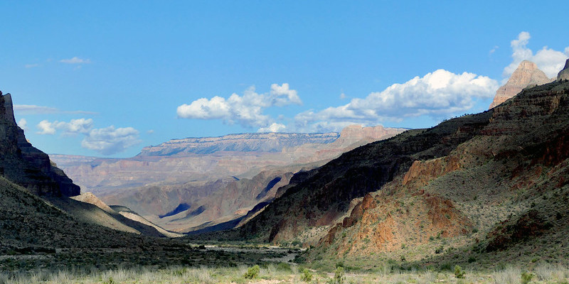
Material box is a material design implementation of the Lightbox plugin. When a user clicks on an image that can be enlarged, Material box centers the image and enlarges it in a smooth, non-jarring manner. To dismiss the image, the user can either click on the image again, scroll away, or press the ESC key.

Creating the above image with the effect is as simple as adding a
materialboxed class to the image tag.
<img class="materialboxed" width="650" src="images/sample-1.jpg">
Initialization
  document.addEventListener('DOMContentLoaded', function() {
    var elems = document.querySelectorAll('.materialboxed');
    var instances = M.Materialbox.init(elems, {
      // specify options here
    });
  });

  // Or with jQuery

  $(document).ready(function(){
    $('.materialboxed').materialbox({
      // specify options here
    });
  });
Options
| Name | Type | Default | Description |
|---|---|---|---|
| inDuration | Number | 275 | Transition in duration in milliseconds. |
| outDuration | Number | 200 | Transition out duration in milliseconds. |
| onOpenStart | Function | null | Callback function called before materialbox is opened. |
| onOpenEnd | Function | null | Callback function called after materialbox is opened. |
| onCloseStart | Function | null | Callback function called before materialbox is closed. |
| onCloseEnd | Function | null | Callback function called after materialbox is closed. |
Methods
Because jQuery is no longer a dependency, all the methods are called on the plugin instance. You can get the plugin instance like this:
    var instance = M.Materialbox.getInstance(elem);

    /* jQuery Method Calls
      You can still use the old jQuery plugin method calls.
      But you won't be able to access instance properties.

      $('.materialboxed').materialbox('methodName');
      $('.materialboxed').materialbox('methodName', paramName);
    */
.open();
Open materialbox
instance.open();
.close();
Close materialbox
instance.close();
.destroy();
Destroy plugin instance and teardown
instance.destroy();
Properties
| Name | Type | Description |
|---|---|---|
| el | Element | The DOM element the plugin was initialized with. |
| options | Object | The options the instance was initialized with. |
| overlayActive | Boolean | If the materialbox overlay is showing. |
| doneAnimating | Boolean | If the carousel is no longer being animated. |
| caption | String | Caption if specified. |
| originalWidth | Number | Original width of image. |
| originalHeight | Number | Original height of image. |
Captions
It is very easy to add a short caption to your photo. Just add the caption as a
data-caption attribute.

<img class="materialboxed" data-caption="A picture of a way with a group of trees in a park" width="250" src="images/placeholder/800x400_d.jpg">
Slider
Our slider is a simple and elegant image carousel. You can also have captions that will be transitioned on their own depending on their alignment. You can also have indicators that show up on the bottom of the slider.
  <div class="slider">
    <ul class="slides">
      <li>
        <img src="images/placeholder/800x400_a.jpg">
        <div class="caption center-align">
          <h3>This is our big Tagline!</h3>
          <h5 class="light grey-text text-lighten-3">Here's our small slogan.</h5>
        </div>
      </li>
      <li>
        <img src="images/placeholder/800x400_b.jpg">
        <div class="caption left-align">
          <h3>Left Aligned Caption</h3>
          <h5 class="light grey-text text-lighten-3">Here's our small slogan.</h5>
        </div>
      </li>
      <li>
        <img src="images/placeholder/800x400_c.jpg">
        <div class="caption right-align">
          <h3>Right Aligned Caption</h3>
          <h5 class="light grey-text text-lighten-3">Here's our small slogan.</h5>
        </div>
      </li>
      <li>
        <img src="images/placeholder/800x400_d.jpg">
        <div class="caption center-align">
          <h3>This is our big Tagline!</h3>
          <h5 class="light grey-text text-lighten-3">Here's our small slogan.</h5>
        </div>
      </li>
    </ul>
  </div>
Initialization
  document.addEventListener('DOMContentLoaded', function() {
    var elems = document.querySelectorAll('.slider');
    var instances = M.Slider.init(elems, {
      // specify options here
    });
  });

  // Or with jQuery

  $(document).ready(function(){
    $('.slider').slider({
      // specify options here
    });
  });
Options
| Name | Type | Default | Description |
|---|---|---|---|
| indicators | Boolean | true | Set to false to hide slide indicators. |
| height | Number | 400 | Set height of slider. |
| duration | Number | 500 | Set the duration of the transition animation in ms. |
| interval | Number | 6000 | Set the duration between transitions in ms. |
Methods
We have methods to pause, start, move to next and move to previous slide.
Because jQuery is no longer a dependency, all the methods are called on the plugin instance. You can get the plugin instance like this:
    var instance = M.Slider.getInstance(elem);

    /* jQuery Method Calls
      You can still use the old jQuery plugin method calls.
      But you won't be able to access instance properties.

      $('.slider').slider('methodName');
      $('.slider').slider('methodName', paramName);
    */
.pause();
Pause slider autoslide
instance.pause();
.start();
Start slider autoslide
instance.start();
.next();
Move to next slider
instance.next();
.prev();
Move to prev slider
instance.prev();
.destroy();
Destroy plugin instance and teardown
instance.destroy();
Properties
| Name | Type | Description |
|---|---|---|
| el | Element | The DOM element the plugin was initialized with. |
| options | Object | The options the instance was initialized with. |
| activeIndex | Number | Index of current slide. |
Fullscreen Slider
You can easliy make this slider a fullscreen slider by adding the class
fullscreen to the slider div. Here's a quick demo.


